
Site Construction 1:
Important Design Concepts
Language is structured with grammar and Design is structured with Design Principles.
There is a grammar of design, and viewers are attuned to these conventions (even if they do not understand them, explicitly). Designs may seem amateurish or unsettling if the design principles are ignored. Still, it is acceptable to decide to break design rules, just make sure it is your choice and not an accident or sloppiness!
The principles of design are the structural elements of a design. The way these design elements are used effect the message of the work. Also, design principles can be used to create a design that appeals (in general) to most viewers' aesthetics. There are five basic design principles: Balance, Rhythm / Repetition, Proportion / Scale, Dominance / Emphasis, and Unity / Harmony. There are also many supporting principles. (Only a few supporting principles will be discussed, here.)
Jump to a topic:
Alignment | Emphasis | Grouping | Spacing | Unity
Alignment
Proper, linear alignment is prolific in contemporary design. Nothing should be placed on the page arbitrarily. Every element should have some visual connection with another element on the page. This creates a clean and sophisticated look. The principle of alignment tells us that every item on a page must be aligned with another item. The alignment of items creates cohesion.
Use alignment to:
- create order
- organize page elements
- group items
- create visual connections
There are several types of alignment that can work together to create a pleasing layout:
- horizontal alignment
- vertical alignment
- edge alignment
- center alignment visual
- or optical alignment
Emphasis
Emphasis means creating a clear focus in a design: a hierarchy of importance among the elements. Emphasis can be used to create interest, clarify the message, and break-up monotony.
The focal point of a design—that part of a design that has the most emphasis and most strongly draw the viewers attention—is the the first the audience notices when they look at the design. Effective designs usually have a "hierarchy of emphasis": a system of graded ranks of visual importance.
Like a good movie, the elements in a good design should have varying degrees of emphasis. A movie has a main character, some supporting characters, and many minor characters. Together, all the characters tell a cohesive story. If the movie focused on all the characters (instead of just one or two main characters), then the story would seem disjoint and confusing. Similarly, a design should have only one main element, a few secondary elements, and many background elements.
Emphasis is also referred to as dominance, point of focus, or interruption.
Emphasis Terminology
Main character = Dominant object
* Primary focus of the design
* Given most visual weight
* Positioned in the foreground
Supporting characters = Sub-dominant objects
* Secondary elements
* In the middle ground
Minor characters = Subordinate objects
* Given the least visual weight
* Recede into the background
Visual emphasis can be created in many ways, such as by using contrast, placement, scale, and color.
Grouping
Visual grouping is a simple matter: just bring grouped elements closer together and leave more space between unrelated items.
Grouping a design' elements helps to make the design's message, as well as the relationships among the elements, clearer. When people first see a group (such as a flock of birds or bulleted list), they tend to see that group as a single object. This initial perception helps simplifiy the information and makes it quicker and easier to comprehend.
Visual grouping is a simple matter: just bring grouped elements closer together and ensuring there is sufficient space around them. Several techniques can be used to aid in grouping: *Placement Color, *Negative space, *Contrast.
Spacing
Considering the empty space in a design is just as important as considering the visual elemetns.
Another subtle, but very important design technique, spacing is the careful handling of negative space between design elements. Space is the distance or area between or around things. Space separates or unifies, highlights, and gives the eye a visual rest.
How To Achieve Good Spacing:
* Bigger/more-important elements get more space.
* Smaller/less-important elements receive proportionally less.
* Grouped elements have less space between them.
* In general, allow more space between the design’s edge and any element (unless it intentionally is run off the page).
* There are no big, empty spaces (for no reason).
* There are not crowded spaces (for no reason).
* Design elements don’t “just touch”, either they overlap (dramatically) or there is space between.
Space Can Be Used To:
1. Give the eye a visual rest.
2. Create ties between elements.
3. Highlight an element (put a lot of white space around something important to call attention to it).
4. Make a layout easy to follow.
5. Make type as legible as possible.
Remember:
*Bigger/more-important elements = more space.
*Smaller/less-important elements = less space.
*
Spacing should have good rhythm. Repetition of spacing scale looks clean.
*
Disregard of spacing can seem amateurish.
Using Alignment: Lack of alignment creates a sloppy, unorganized look. Mixing too many alignments can have a similar effect. However, it's also OK to break alignment when it serves a specific purpose such as to intentionally create tension or draw attention to a specific element on the page.
Unity [unity, cohesion, harmony]
Cohesion of the visual elements, the idea that each has a relationship and comprise part of the whole design.
Designs with "unity" have a sense of wholeness; conversely, in designs that lack "unity" the visual elements seem unrelated to each other. Unity is the coherence of the whole: the sense that all of the parts are working together to achieve a common result.
There are many ways to help create unity, such as by using a certain style or constrained color palette. Other techniques include the use of the Gestalt Principles of Perception, visual bridges, visual glue, flow, and contrast. Unity can also be achieve conceptually: by repeating a common theme throughout otherwise visually-disparate motifs.
 |
 |
Good Unity: Here, color choice, linear layout, color scheme, and a constrained style help create a good sense of unity. |
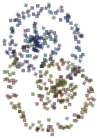
Bad Unity: Do you see how the visual elements in this design seem unrelated to each other? |
©101 Design